Wednesday 8 July 2015

Comedia dell'arte

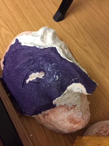
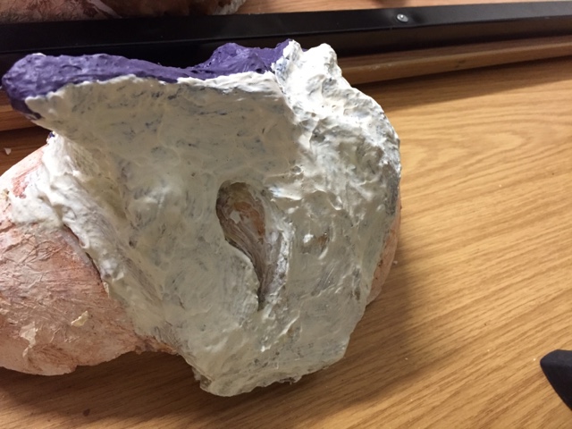
This is my final piece for commedia dell'arte final piece. To start with we mod-rocked our own heads to get the base shape of our mask. We then created a plaster inner so that it would be stronger and easier to work with as the next step we made a clay overlay which would actually be the shape of the final mask. After the clay process we used around 4-5 layers of latex and another 3 layers of latex and thickener. To finish off I used thickener, latex and paint so that I would get some colour onto my piece. 
The resin I chose to have my design half white/ cream and half purple is because my character is the which and he main characteristics are that she is earth and magical and often witches deskies there selves as something which they aren't hence the purple. I also added the jagged and bumpy effect so that it would give the mask that earthed effect. Overall to improve the design I could of made the purple side looked more ripped off so it looks as if the mask was hiding the witch personality. But I am happy with the shape and earthed affect on the mask. 

Wind in the willows mask plan

This is the plan for the adjustments of my mask. I am planning on creating a moving neck mechanism which is based on a metal cross hatch design which will be surrounded by a cool/ spring with fabric surrounding it. I've also planned to balance and lighten the overall head so that it is easier to carry and perform with. The bottom half of the costume will be the same fabric as the neck and will have a fury belly. 

mondrian research and evaluation of final design.

this was a direct influence in my bus station idea because i wanted to have a design which incorporated bright colours as in my curtain wall designs it had to be shades of grey. 

this is my final design and i went for a stylised approach to the looks of both the bus station and the civic sculpture. also the lines of each aren't blocky they are swept so it looks as if its 3D. i chose the bus station and the sculpture because it promotes how worksop is evolving in the art industry. 

wind in the willlows

its an english children's story about a toad, badger, rat, mole and a gang of weasels. the animals in the story have both characteristics of the animal and human. its quite a slow start to the story but once the reader gets deeper into the whole plot the pace quickens.
Rat and Mole meet and become friends. they take an adventurous ride down steam when they come across Toad hall. this is when they meet Mr. Toad who's very sporadic, egocentric character who's life is for filled with fads and mischief (the two are often linked). Toads obsessions lead the group into many adventures all to operate a motorcar.
the friends seek help from badger (who is basically the wise old man of the story) because toad has got himself into some bother due to is careless attitude. mole and rat feel as if they almost have to protect toad from himself through out the whole story.  even a word from the wise badger didn't change toads mind. to save toad the trio decide that he needs to be kept under arrest. mole then steals a car and crashes it. he is then sentenced to a 20 year prison sentence. he escapes form prison with great help from the jailers daughter.
due to toads arrest, toad hall has been broken into and taken over by the gang of weasels who have set out to vandalise and abuse the hall. toad heroically saves the day by taking back the hall and casting out the gang of weasels. he then apologises to the trio and they live happily ever after.

alice in wonderland final piece

this is the final piece for alice in wonderland I've based it on promotional poster for the alice in wonderland film.
the photograph background originally looked like this...
i then changed the levels and curves of it so that the chair isn't visible and the rest of it is pretty close to black. i then cropped the image o that it was more of  land scape image. after this i de saturated the the back ground so it the focus would be on the cats faec and the text. i then added the cat face ant the text to the overall image. 
to conclude, my overall thought process for this image was to advertise so i didn't want to go to into depth with the overall plot but enough so that it would draw in an audience.


weasel character analysis


The weasel actually only appears towards the end of the book. Although his scene is short it is important for the story as the weasels downfall brings the group of friends closer together. The chief weasel is the leader of all the weasels and stoats and therefore leads them to do his bidding. Being from the Wild Woods all the animals themselves are not the nicest and are described as scary and mean characters. But the Leader (my character) is especially manipulative and nasty. He is cunning and will do anything to get what he wants. In this case he will do anything to take over Toad Hall. He's a ruthless leader and that is why he fights against the four main characters in his quest to have the best residence. Perhaps he does this in his hopes to up their ranking from the wild woods to the best place in the book and it's all just a status thing.

Bus station sketch book work

These are my sketches. They started with experimenting with how I could make the turbine an interesting style and shape and then escalated into a form of typography where I would use the word WRKSP so it would be directly related to worksop  

Quote for Alice in wonderland final piece

This is the quote that I'll be using to put above the photo I took and the illustration I did. I chose this quote because it almost feels like it is directly applicable to the situation the art industry is in. What I mean by this is that there are still may people who frown at the thought of creativity and change but to move forwards change is needed and the quote sums up just how important our imaginations are. It's easy to follow the crowd but to make a change imagination is needed. 

air brushed effect


 this the screen shots which we took to help us remember the air brushed effect.


Comic colour choices

In my comic I chose to go for a scribbled look so that to create a focal point in each cell all that's needed is for that one bit to be coloured up in full. I also like the slightly scribbled effect because it can be effective when trying to add a depth of feild into some of the cells. I actually got the scribbled idea from watching one of the spider man films from roughly 2002 and it was implemented again in the film kick-ass. Personally I just liked the way it looked and thought it would be interesting to try out in my new comic. 

Monday 6 July 2015

More bus station sketches

This is the abstract bus station x sculpture design pre-illustrature. It's an stylised interpretation of what the sculpture and the station look like. 

Final comic sketches

This is my final sketches of the comic strip I've got roughly 30 cells and each cell will take up each page. This comic is the follow up one which I created in unit 12. In this comic it shows chap (main character from pervious comic) being sent to finish what he started in the comic before by once and for all destroying Sen (the onion) but what he doesn't know is Sen has been gathering up power from his previous victims and colleagues to make himself a super food. Chap and him go into battle head on and chap soon discovers this will be no walk in the park. Tato (the old chip or update of this comic) soon realises he big of a mistake he's made by sending chap in unprepared and unaware of this newly formed food. Tato takes it on himself to go out and battle by chaps side to help defeat this monster in hope they can say the stews. 


Bus station sketches

These are a few of my sketches. You can see from these 3 key point my thought process. 
Originally I set out to try and make a developed and stylised looking turbine. There was a few designs where I experimented with the shape and size of both the blades and base of the turbine. When doing this i then realised that turbines were to generic and didn't specifically pin point worksop. to solve this i tried to add a message or some kind of text to give it a personal touch to worksop. i then tried combining my previous graffiti designs into this one which was effective but it also didn't specify worksop to then solve this dilemma i looked at some of workshops most interesting buildings architecturally. this then lead me to places such as, the old water tower, savoy cinema, the river side pub and some more recent things such as the civic sculpture and newcastle road bus station, where the design could be showcased. i then looked at different forms of typography and realised that typography is based around words making shapes, i then thought to myself why not the other way around?
let the building/object make the word! 
i began by choosing the word or phrase i would be using. this word was vital to my whole design as it would determine how successful the piece would be. it would have to directly sum up worksop and be snappy enough to draw viewers into the piece. i settled for just trying to incorporate worksop as the word but taking away the O's as they would be repetitive. 
in my design i chose to use the cinema, sculpture and the tower as the W. the water tower, the river bridge form the view at river side pub and some clouds to make the R. a river turning into a road as the S. the curve of the gustation roof and wall to make a P and i used a normal bold K so the viewer wouldn't get put off by the image and would look closer into the piece.