Art&design student at north notts college. I certify that the work submitted is my own. I've clearly referenced any sources used. understand that false declaration is a form of malpractice
Showing posts with label unit 45. Show all posts
Showing posts with label unit 45. Show all posts
Tuesday, 29 March 2016
thyco inspired poster
these are my poster which i developed taking inspiration from the two thyco posters
the first one was to really make sure i got that radiated colour effect altering the gamma and contrast of the photo.
i then extruded the grass pixels to give it that futuristic tech flooring effect.
after this i began looking at appropriate quotes that would fit with both promoting the creative scene and the photograph its self. looking through i started by looking at broken roof quotes which lead into looking at architectural quotes to do with society. i came across this quote from sir isaac newton with fits the photo perfectly as theres 3 very distinct walls in the photo and if you look closely theres 2 very thin and flimsy seems/bridges across the walls. the quote also fits well with the message I'm trying to put across as the art industry are the ones who's trying to build the bridges across to society and the mainstream so that we can get noticed and recognised for our contribution.
Tuesday, 15 March 2016
photography poster 1
these are the first photography manipulated posters.
the first one shows a faucet getting sucked into a blackhole with the copy line 'could you cope without?' suggesting that without art the faucet wouldn't of been designed. this designs not very well thought through but it was just a start point for me to build ideas off.
the second poster shows one blank, one painted and drawn on art board. the reason behind this is to show where great pieces of work came from. although the one on the right looks much tidier its been utilised to the same extent as the other one because it looks as if its never been used before. the flaws in this were the way i wanted to present the text because i was unsure to go from cloud to tone or one colour. so i tried colour through to tone and you couldn't really see what the middle word says.
i then tried block colour and ran into the same sorts of problems but slightly less so my next plan of action is to figure out a way to make the text easily readable.
i also added a shadow around the whole thing to zone it into the text.
Tuesday, 1 March 2016
Typography poster
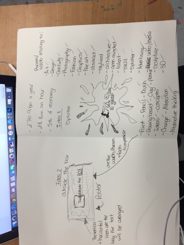
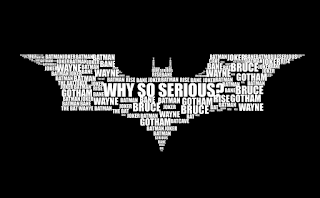
this is the process i wen through to get to my final poster. i started by looking at some facts about the general creative industry in the UK. for example, the creative industry brings in £76.9bn a year, £8.8m an hour and makes up 5% of economy. I then began looking into types of typography and was interested in how the batman logo/symbol looked so i pursued that and though of idea around that sort of typography. the first idea was a splatter because i thought it was sort of a general artistic mark but then thought about it and didn't like it because it wasn't very well thought throw and generalised art as a whole. i moved away from the shape and focused on the words id use in the poster and through that came up with a poster idea. 'Thinking Outside the Box' is the name of the idea behind the poster and it consisted of a landscape page with a box just left of the centre, inside the box it'd have think and the text would continue, outside the box.
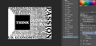
i then went onto the mac and photoshopped the design using the words and facts i researched.
the black and white one was towards the end of the making of the poster but its showed when i first discovered the drop shadow effect on text which helps bring the text out.
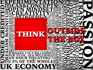
i then showed my fellow students and they said theyd like to see more colour in the piece i responded to that by going back into photoshop and changing the colour of the box itself and the colour of the 'outside the box' to red. i also added a shadowed affect to the top and bottom of the text and all the way around the box. then realising the text inside the box looked below par so i used the drop shadow again to keep some continuity through the piece and added slight shadowed affect around the outside of the whole poster using the paint brush tool set to black on 17% opacity.
overall, I'm happy with the piece because through out the whole project i wanted to show the art industry as a whole not backing down to the norm so to speak and making people realise how much we actually do for the UK as a whole. this piece quite clearly shows this from the aggressive red box and text and even the words that make up the piece refer to some of the materials, techniques and processes artists use. it also gives many examples of characteristics which successful artist not only need but have. the piece itself isn't to tell people to become an artist but its just to highlight the importance of artists nation wide and to promote 'outside the box' thinking.


Monday, 29 February 2016
quote screenshots 2
these quotes aren't directly from or incorporate the word art or creativity in them but they are really inspirational and humbling which is the whole reason behind making the posters. we are promoting art and often times art speaks for itself so why do we suddenly need to speak for it in these posters.
i chose these quotes from famous ufc fighter conor mcgregor and joe rogan because mixed martial arts is quickly growing passion of mine and in my head i can often directly link traditional art to martial arts because thinking about it fighting is the oldest art form.
idea 1! creative mess, tidy idleness
my first idea for unit 45 is to show a mess which lead to creating so really well thought through art work in comparison to a tidy space which hasn't been utilised due to idleness.
the idea itself is to incorporate two drawing/painting boards. one with all the paint and drawings still on it and the other completely plain and white. I've photographed it with 2 different angles and when i go on photoshop later on today ill decide which on i like best.
the quote ill be using basically highlights the fact that a creative mess is better than tidy idleness. I've not yet got a solid quote but I've got 4-5 variations for this idea.
Wednesday, 17 February 2016
Tuesday, 9 February 2016
wax crayon experiment ideas
1. taping a row of crayons to the top of a page and melting them allowing them to drip down the page
2. putting multiple crayons inside a plaster ball. this is to see that the crayons will react like when exposed to the heat of the plaster.
3. making a cone shape out of paper or card, placing the crayons in a circular fashion at the point of the cone and melting them.
2. putting multiple crayons inside a plaster ball. this is to see that the crayons will react like when exposed to the heat of the plaster.
3. making a cone shape out of paper or card, placing the crayons in a circular fashion at the point of the cone and melting them.
mondrian post war grid art
he began painting grids in late 1919, 1920 and flourished in the intellectual freedom that enabled him to embrace a pure abstract form for the rest of his life. in his early paintings the lines were grey and slowly faded as they got closer to the edge. there also used to be less white boxes in the paintings.
conceptual art or conceptualism
art in which the concepts or ideas are more important than the traditional aesthetics and materials. the idea becomes a machine that makes the art.
Monday, 1 February 2016
Saturday, 30 January 2016
concept photography
https://en.wikipedia.org/wiki/Conceptual_photography
a photo which illustrates an idea, derived from conceptual art.
a photo which illustrates an idea, derived from conceptual art.
Tuesday, 19 January 2016
these are some bauhaus graphics where you can see how they implemented the primary shapes, colours(multiple tones) and green. in the bottom image i like how theres silhouettes in the background however unlike most they are actually lighter than the back ground. the top 2 images i chose because the were very effective although simple.
tycho posters
in these two images theres a distinct editorial factor to them both. the top image has quite clearly had a minimum of 3 separate images combined together. its also had some colour alteration in the horizon which compliments the light trails in the fore ground.
the second image hasn't had multiple images combined together but its had some drastic colour alterations the greens. blues and magentas are very harsh.
propaganda posters
posters like this is what filled the creative scene during the 1st and 2nd world war. this was in hope to inspire and create controversy between the opposing sides.
I've choose this one because i like the block, bold colours and the way the posters composed.
Monday, 18 January 2016
advert inspiration ideas (monster advert)
https://www.youtube.com/watch?v=Mmh-ew1swD4
this is a monster ad and i like how its shows two very different people at the start. one very mainstream and the other clearly an extreme person. then he jumps over her giving her a glimpse of the lifestyle of being creative on an extreme level and then he turns around and picks her up so metaphorically showing her what the extreme and creative lifestyle looks like.
this is a monster ad and i like how its shows two very different people at the start. one very mainstream and the other clearly an extreme person. then he jumps over her giving her a glimpse of the lifestyle of being creative on an extreme level and then he turns around and picks her up so metaphorically showing her what the extreme and creative lifestyle looks like.
first idea of advertising
poster
video-a quick lifestyle advert with voice over showing how pretty much everyones mornings are the same and then show how lives different when your creative. use gopro/first person so that it shows the perspective of the person. this gives instant reliability to the ad.
a few examples of this are:
https://www.youtube.com/watch?v=nBO67EP3Xz8
facts about the creative industry
£76.9bn a year
£8.8m an hour
5% of economy in uk
35,073 software and games
10,248 advertising
9,938 publishing
9,308 film&TV
5,453 music, arts&culture
£8.8m an hour
5% of economy in uk
35,073 software and games
10,248 advertising
9,938 publishing
9,308 film&TV
5,453 music, arts&culture
Subscribe to:
Posts (Atom)


