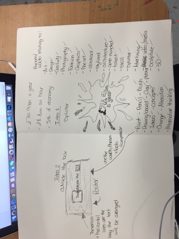
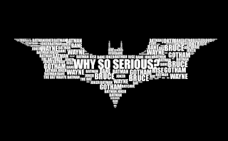
this is the process i wen through to get to my final poster. i started by looking at some facts about the general creative industry in the UK. for example, the creative industry brings in £76.9bn a year, £8.8m an hour and makes up 5% of economy. I then began looking into types of typography and was interested in how the batman logo/symbol looked so i pursued that and though of idea around that sort of typography. the first idea was a splatter because i thought it was sort of a general artistic mark but then thought about it and didn't like it because it wasn't very well thought throw and generalised art as a whole. i moved away from the shape and focused on the words id use in the poster and through that came up with a poster idea. 'Thinking Outside the Box' is the name of the idea behind the poster and it consisted of a landscape page with a box just left of the centre, inside the box it'd have think and the text would continue, outside the box.
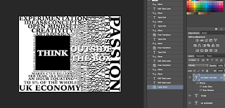
i then went onto the mac and photoshopped the design using the words and facts i researched.
the black and white one was towards the end of the making of the poster but its showed when i first discovered the drop shadow effect on text which helps bring the text out.
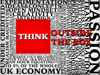
i then showed my fellow students and they said theyd like to see more colour in the piece i responded to that by going back into photoshop and changing the colour of the box itself and the colour of the 'outside the box' to red. i also added a shadowed affect to the top and bottom of the text and all the way around the box. then realising the text inside the box looked below par so i used the drop shadow again to keep some continuity through the piece and added slight shadowed affect around the outside of the whole poster using the paint brush tool set to black on 17% opacity.
overall, I'm happy with the piece because through out the whole project i wanted to show the art industry as a whole not backing down to the norm so to speak and making people realise how much we actually do for the UK as a whole. this piece quite clearly shows this from the aggressive red box and text and even the words that make up the piece refer to some of the materials, techniques and processes artists use. it also gives many examples of characteristics which successful artist not only need but have. the piece itself isn't to tell people to become an artist but its just to highlight the importance of artists nation wide and to promote 'outside the box' thinking.


No comments:
Post a Comment