Tuesday, 29 March 2016


thyco inspired poster
these are my poster which i developed taking inspiration from the two thyco posters
the first one was to really make sure i got that radiated colour effect altering the gamma and contrast of the photo.

i then extruded the grass pixels to give it that futuristic tech flooring effect.
after this i began looking at appropriate quotes that would fit with both promoting the creative scene and the photograph its self. looking through i started by looking at broken roof quotes which lead into looking at architectural quotes to do with society. i came across this quote from sir isaac newton with fits the photo perfectly as theres 3 very distinct walls in the photo and if you look closely theres 2 very thin and flimsy seems/bridges across the walls. the quote also fits well with the message I'm trying to put across as the art industry are the ones who's trying to build the bridges across to society and the mainstream so that we can get noticed and recognised for our contribution.

Tuesday, 15 March 2016
photography poster 1
these are the first photography manipulated posters.
the first one shows a faucet getting sucked into a blackhole with the copy line 'could you cope without?' suggesting that without art the faucet wouldn't of been designed. this designs not very well thought through but it was just a start point for me to build ideas off.

the second poster shows one blank, one painted and drawn on art board. the reason behind this is to show where great pieces of work came from. although the one on the right looks much tidier its been utilised to the same extent as the other one because it looks as if its never been used before. the flaws in this were the way i wanted to present the text because i was unsure to go from cloud to tone or one colour. so i tried colour through to tone and you couldn't really see what the middle word says.

i then tried block colour and ran into the same sorts of problems but slightly less so my next plan of action is to figure out a way to make the text easily readable.
i also added a shadow around the whole thing to zone it into the text.

Tuesday, 8 March 2016
CV development
Curriculum Vitae
Charlie Chambers
2 Cavendish close, Creswell, Worksop, Nottinghamshire, S804HZ
07772636008 or 01909720551(House No)
19. British male from Worksop, Nottinghamshire
Education&qualifications:
Art&Design level 3 extended diploma PPP
AS level Art-C
AS level Extended Project-C
GCSE Mathematics-B
GCSE English-C
GCSE Science-C
GCSE Science 2-C
GCSE ICT-Pass
BTEC Art&Design-Pass
GCSE Spanish-D
Relevant skills:
Work as both a team and on my own. I've developed this through my current job at Greencore, Worksop where I'm given a designated area to clean single handedly and when I'm done I will then help the other workers complete their jobs. Due to my passion of productivity.
My communication has been developed through my current job, as I have to work in a team fluidly and must communicate clearly otherwise I become a hinderance rather than a help to my fellow employees.
I've almost entirely learnt how to manage my time through my current job as I've got a set time to clean my designated area, if I'm late disciplinary action will be take thus risking my job. At the same this enhances my performances under pressure giving me that pin point focus mindset.
These give me the confidence in my work and due to this ill never feel awkward or disappointed in myself.
I utilised these skills in my creative work, where a client gave me the job of creating 3 unique window manifestations which will run the perimeter of the bus station and a 2.5x4 meter piece to which would uplift the spirits of the area. It's placed high up on that bus station walls, above the glass. This all had to be fully developed and completed within a 3 month time period.
Hobbies&Interests:
Throughout my life I've had many interests which all relate to that action sports daring lifestyle. From a young age I raced BMX nationally and then slowly grew into the freestyle BMX scene. During this I had other side hobbies such as karate, chess, rugby, nitro car racing, Mountain biking etc. I've put all of those away and focused on primarily creative hobbies for example Muay Thai, Brazilian Jiujitsu, Wrestling, Photography, graphics and illustration, thus developing my mental and physical artistic eye. This is making me look at life in a much different light and developing me artistically as a whole. However, photography has in many was became my sole passion, the thought of capturing a significant moment in time appeals to me in a way thats indescribable. I've even gone as far as creating a Facebook page showing my amateur photography work. To showing relevant moments in my life.
FMP start-initial ideas
at the moment I'm wanting to gravitate away from the sports photography and towards the lifestyle photos. that much I'm aiming to just take lifestyle, landscape, travel and culture photos. I'm also going to think more in-depth into each photo as i go along and trying to pull out some subconscious thoughts and messages my photos say.
Thursday, 3 March 2016
1950s design
the comparison between the abstract expressionism in america and the communist looking russian art.
the housing is very retro so to speak had hints of jazz and was very colourful.
americas association with britain
-cottages
-tea
-fields
-floral patterns
we sold america the look of being british.
britain was on a rationed diet at the time and not only that the supplies were rationed as well. thus not allowing us to print the floral look of britain at the time. so what ever materials we got hold of we printed floral and gave it that british look to export for cash during the war. so after the war we threw all that out because it reminded people of the war and of worse times, plus people got bored of it because they weren't doing it for fun during the war they were doing it to survive.
after the war there was major technological advances in everything art, machinery etc.
Tuesday, 1 March 2016
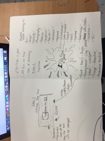
Typography poster
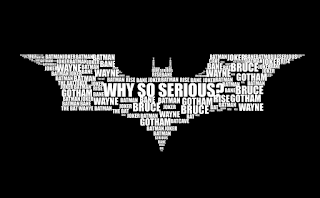
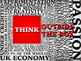
this is the process i wen through to get to my final poster. i started by looking at some facts about the general creative industry in the UK. for example, the creative industry brings in £76.9bn a year, £8.8m an hour and makes up 5% of economy. I then began looking into types of typography and was interested in how the batman logo/symbol looked so i pursued that and though of idea around that sort of typography. the first idea was a splatter because i thought it was sort of a general artistic mark but then thought about it and didn't like it because it wasn't very well thought throw and generalised art as a whole. i moved away from the shape and focused on the words id use in the poster and through that came up with a poster idea. 'Thinking Outside the Box' is the name of the idea behind the poster and it consisted of a landscape page with a box just left of the centre, inside the box it'd have think and the text would continue, outside the box.
i then went onto the mac and photoshopped the design using the words and facts i researched.
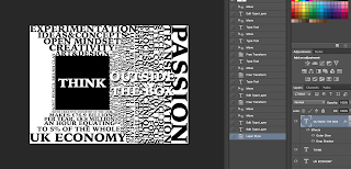
the black and white one was towards the end of the making of the poster but its showed when i first discovered the drop shadow effect on text which helps bring the text out.
i then showed my fellow students and they said theyd like to see more colour in the piece i responded to that by going back into photoshop and changing the colour of the box itself and the colour of the 'outside the box' to red. i also added a shadowed affect to the top and bottom of the text and all the way around the box. then realising the text inside the box looked below par so i used the drop shadow again to keep some continuity through the piece and added slight shadowed affect around the outside of the whole poster using the paint brush tool set to black on 17% opacity.
overall, I'm happy with the piece because through out the whole project i wanted to show the art industry as a whole not backing down to the norm so to speak and making people realise how much we actually do for the UK as a whole. this piece quite clearly shows this from the aggressive red box and text and even the words that make up the piece refer to some of the materials, techniques and processes artists use. it also gives many examples of characteristics which successful artist not only need but have. the piece itself isn't to tell people to become an artist but its just to highlight the importance of artists nation wide and to promote 'outside the box' thinking.

Subscribe to:
Posts (Atom)