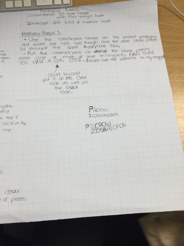
In this sheet below it shows my first strong product idea by using a icosehedren (20 faced shape using triangles) as the packaging. I've decided to go with shapes and object that begin with 'I' because after much development I indirectally placed a 'I' in my logo and rather change my logo more and waste time dwelling just encourperate it into my product.
The second picture is of my development of my logo since the concept sheet. I've also highered age in which I'm targeting with my product as I've noticed although it may appeal to a slightly younger audience than what I've altered it to, i won't have to change the advertising as the younger audience will be already inclined to this advertising.


No comments:
Post a Comment