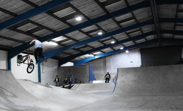
In these photos I've took advantage of the bold colours in both the bins bad background.
In this photo I've been more suttle with the desaturation and kept some of the yellow tint but upped the blue and cyans.


In this one I attempted to keep the contrast up on the foreground ad background but down on the rider however, it's wasn't the greatest photo I've ever take so the rider still looks as if he's blending into the ceiling. Also I've rather than up the blues and cyans I've just kept them raw and desaturated every other colour.

This photo is my favourite out of this series because I've clearly highlighted the blues and cyans again. The difference with this one is I selected Krzysztof and copied the selection on another layer, this is so that when I desaturated the background layer the colour won't come out of the rider. After desaturation I still wasn't happy with how he was highlighted and still looked abit dull to me so I upped the contrast and brightness, slightly which gave it the focal point it need.

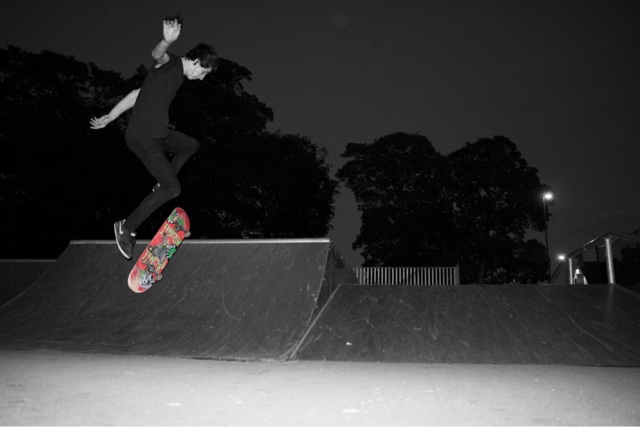
The two below are the first 2 in this series of photos. I selected the bike/skateboard again so it wouldn't be discoloured when desaturation get the image. I desaturated and upped the contrast and brightness appropriately. Although I'm not to pleased with how much the red bike comes out of the photo. It almost feels as if it was too far away however, I like the background and depth of the foliage.

I particularly like this one as the rider pops out of the photo even when desaturated because of the thick trees in the background although I'm not happy with how there's a fence and a street light in the centre right and right of the photo. I also like how the mostly red skateboard is extreamly eye catching because of the green graphics.

No comments:
Post a Comment